CERAMICS BRAND IDENTITY | FRANCEKERA Ceramics
Celebrating raw textures and organic shapes.
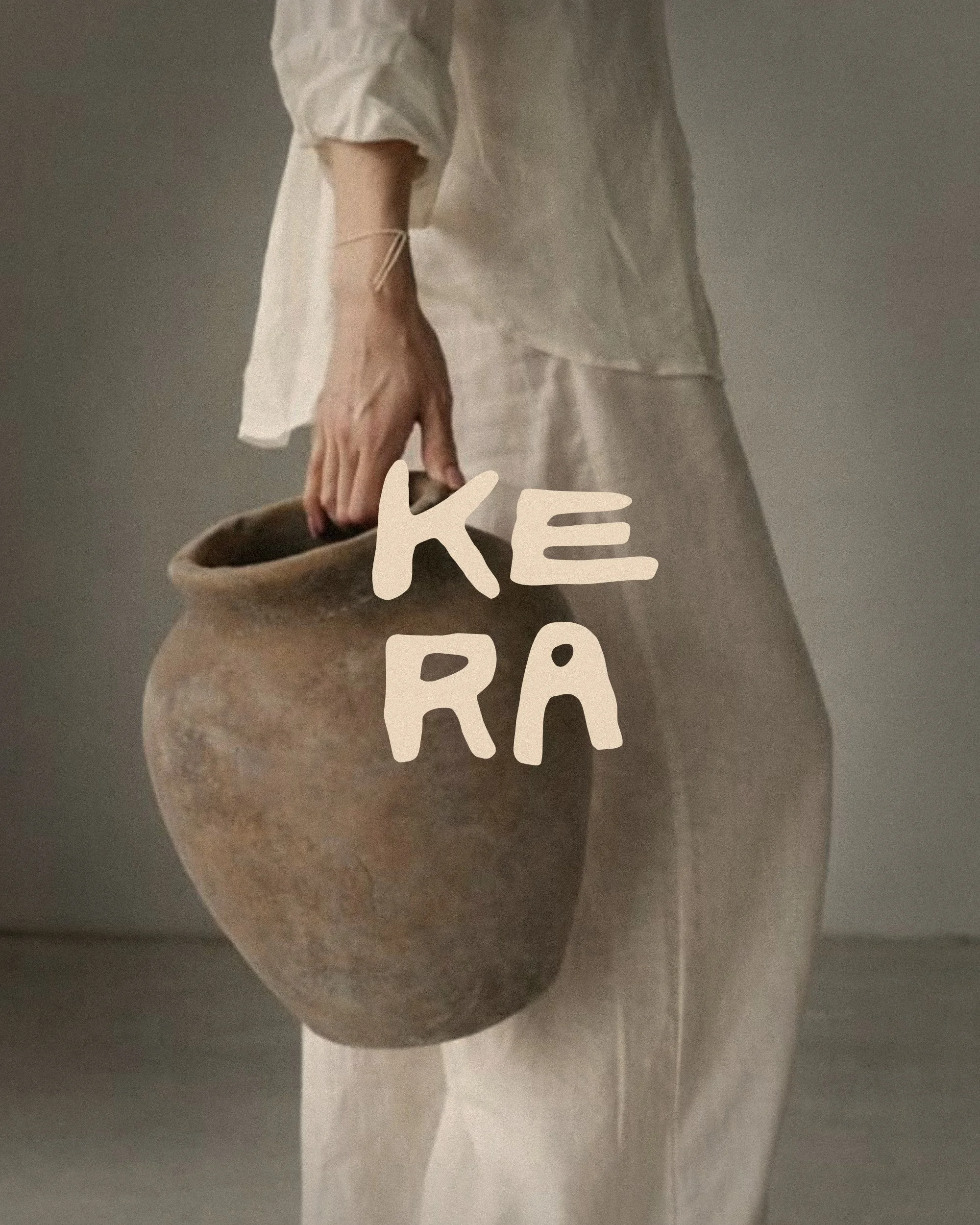
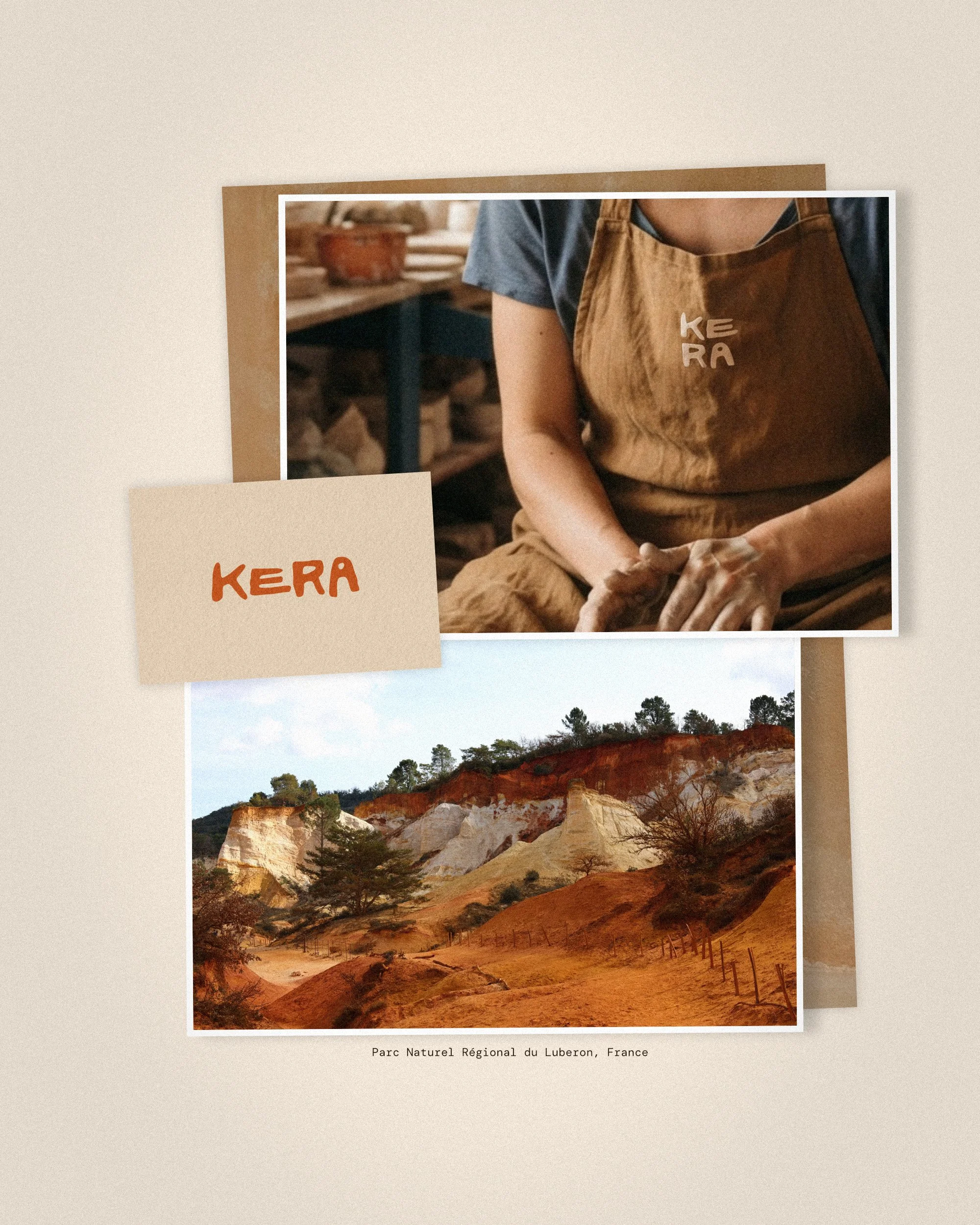
KERA came to us for a complete rebrand to elevate their position within the luxury artisan market. Based in the Luberon, France, the studio creates ceramics directly from local clay, celebrating raw textures, organic shapes, and natural imperfections over mass perfection. They needed a visual identity that honours this authentic, handmade process while positioning the studio as a refined, high-end craft house.
Scope of work
• Art Direction
• Primary Logo & Brandmark Suite
• Full Brand Guidelines
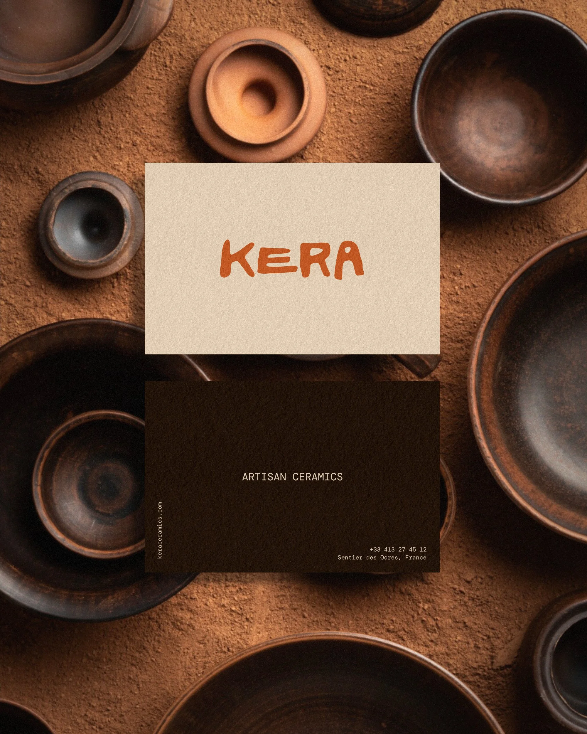
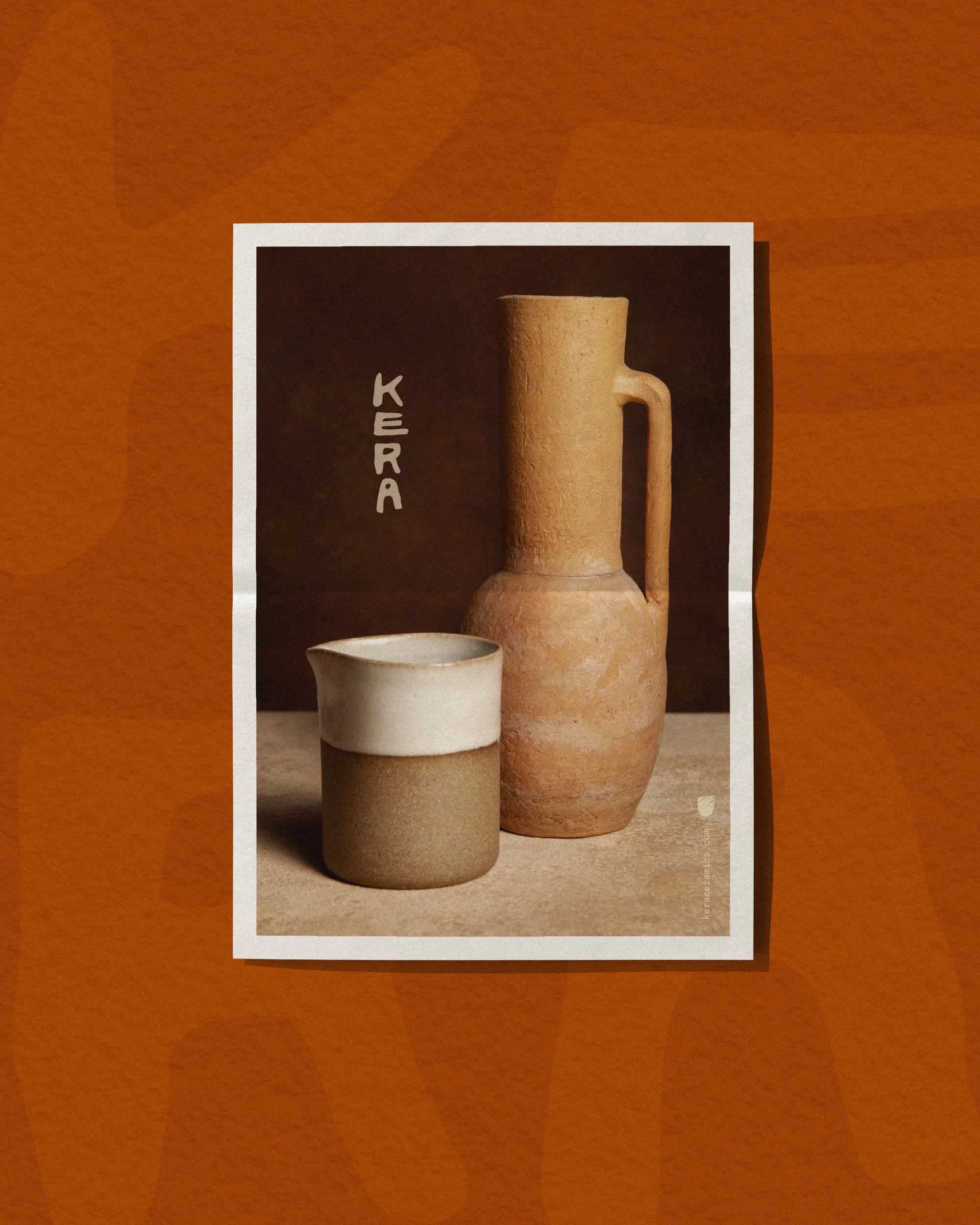
• Print Collateral
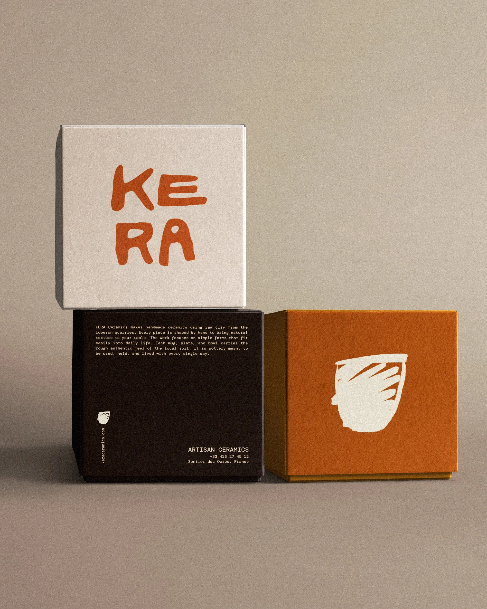
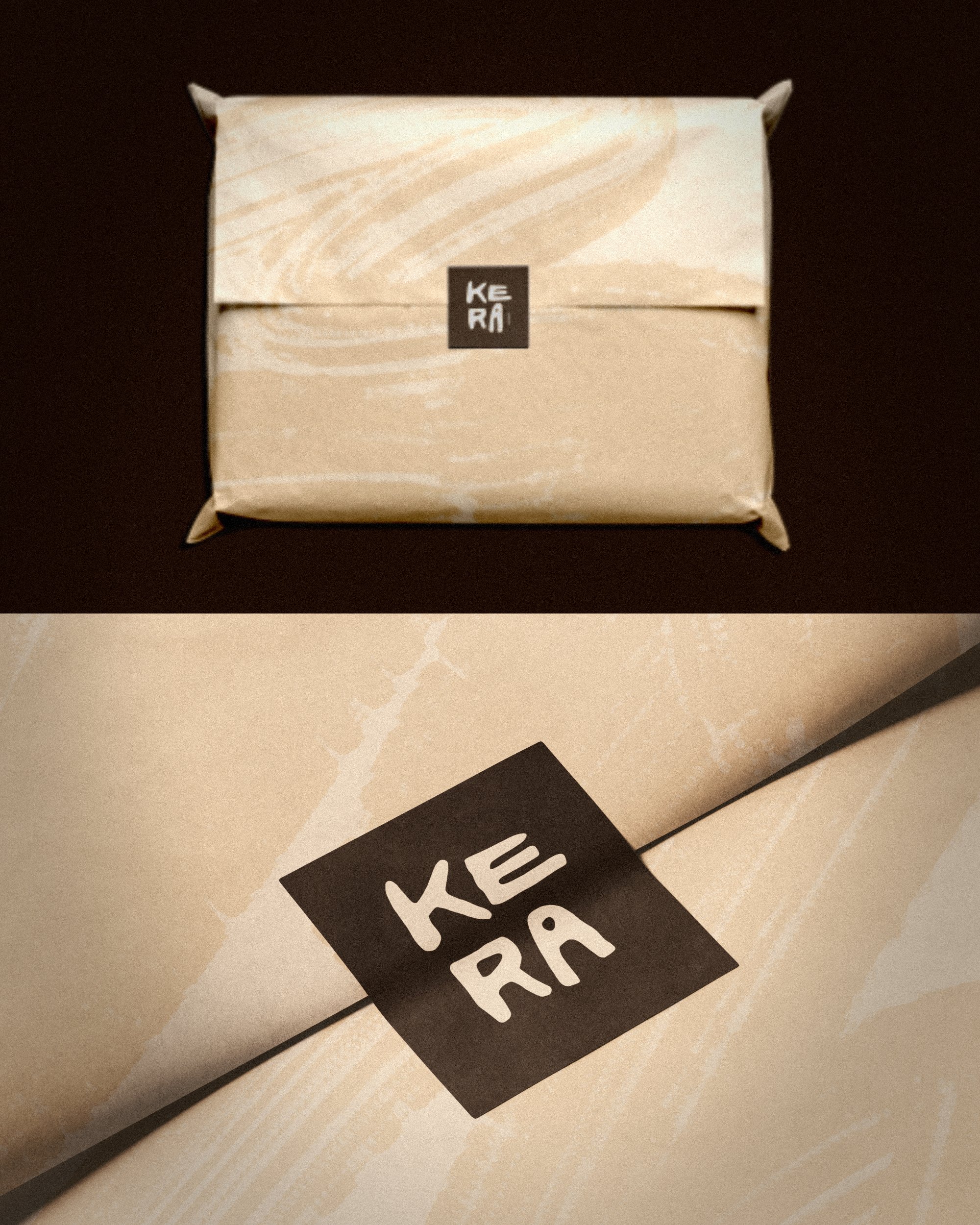
• Packaging
Creative Response
The visual identity draws directly from the raw earth and ochre cliffs of the Parc Naturel du Luberon. We designed a tactile, hand-carved typographic logotype that feels organic and sculptural, echoing the soft, unrefined curves of raw pottery shaped by hand. Paired with a minimal, typewriter-style secondary font for detail copy, the system balances raw earthiness with modern luxury.
The colour story stays grounded in the region’s natural palette: rich terracotta, deep umber, warm stone, and sun-baked ochre. From raw-edged paper stock and textured cardboards to custom brush-stroke packaging and artisanal linen aprons, every touchpoint reinforces the beauty of human touch and the authentic soul of local soil.